I felt that outline and facia of the shopfront needed to be kept relatively simple so not to compete with the content of the window display. Also, in order for me to show my designs in context I felt that it would work better in an illustrative format, rather than applying it straight onto a photographic version. Eventually I would like to try this to see how well it comes out as this would be of course how it would look, were it to be used. For the purpose of my context mock up however I shall continue to develop the application onto an illustrated shop front using the above as my template.
Experimenting with layout.
The placement of my design is vital and must be at the correct level in order for the display to work. For example if the transfer was to be centered completely it would be covering the display behind. If the design is placed too high or low, it will then be out of eye level. I am also concerned that the strap line, 'better by a country mile,' must be placed accordingly too in order for it all to work well.
Introducing manikins. I have introduced the outline of the manikin behind the glass and transfer so you can get an idea of depth and to help me with the positioning of the transfer and strap line. It is interesting how the whole design shifts once you add the depth of another layer.
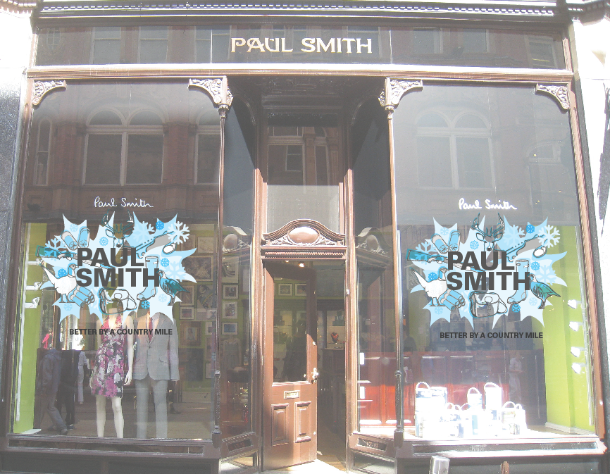
Applying the design to a photographic context.
As you can see the design really gets lost within the photograph here. I have lowered the transparency levels on the design so that it looks more like it is applied on the glass and that you can imagine looking through it to the display behind. It is also being applied to a real Paul Smith shop front taken in the Victoria Quarter, Leeds. Also the shop front I modeled my illustrated template on. I feel the Autumn design out of the two applies better onto a photographic context.
I felt that the space above the door was too valuable to go to waste. So I have experimented with placing an image or text in the space. Out of everything I tried the strap line 'Better by a country mile,' looked the best. Anything else was competing too much with the main design.
Experimenting with strap line positioning.
Placing it separate to the design, along the bottom seems to work better than having it part of the design. Before I felt as if the type was almost cutting the window in half when it was placed just under the main design. Having the design at the top sits it just nicely above the manikins and all 3D displays inside and then the strap line sits well along the bottom, still staying in eye level so it's not too low to read. This is going to be the layout I shall use.
Final Autumn shop front.
Final Winter shop front.
In these two mock ups you can see the positioning of everything. From the main window transfer, to the strap line transfer along the bottom, to the layer that sits behind as manikins and the final layer of the back-drop. I feel that they both show the depth of the design quite well and you can get an idea of how the eye of the customer would understand it.
Display back-drop experiments:
These are screen grabs taken from my back-drop development. I just wanted to take part of the logo to produce something simple but effective to fall behind the manikins providing a background. These are the designs I have tried so far...